30 Hertford Road
Dalston, London
22 Nov – 30 Nov 2008
Photos: NoLionsInEngland except where stated
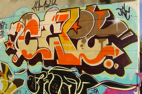
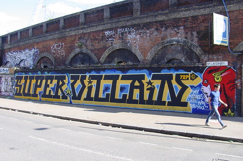
A natural separation in graffiti culture requires art fags admiring street art to take their asymmetric haircuts and pink glassless glasses to Shoreditch, while the hard core graff guys get their secret society writer-shall-write-only-for-writer thing up in the provinces, like Hackney, Hounslow and Dalston. One person who metaphorically lives within both worlds is Cept. Actually Cept exists across far more than two worlds. There’s the Cept who has been ruling the streets for over 20 years tagging and writing and generally getting up with TRP crew.
Then there’s the Cept who takes spray can art to the streets
There’s also the Cept who transfers his street persona to canvasses and gallery walls, more of that soon. Finally there’s Mike Ballard, the St Martins graduate artist who inhabits Cept’s body and surfaces from time to time to produce dark and jumbled paintings. Or is it the other way round?
To find all these Cepts means orienteering to a labyrinthine and rickety lockup workshop in a dimly lit and nondescript warren of utilitarian housing estate streets behind Kingsland Road. Bang loudly on the corrugated shutter with a number 30 on it!
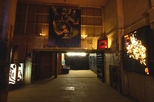
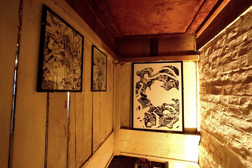
The ground floor space looks like an artist’s store room, heavy oil paintings are mounted high on coarse brick walls, an illuminated cocktail light box is pushed into a corner, in small dead-end cubicles small screens show looping scratchy multimedia film clips while all around are many relics and wall daubings of former occupants. The roughness of the room mirrors the artist’s determined avoidance of pretentious frippery, a white cube this ain’t.
Since impressionism, artists have been preoccupied with battling against the perceived notion of an accepted art, the grand art of landscapes and religon which is displayed to show good taste, worthy subjects and high technique. Cept sees the acceptance of graffiti and its entry into galleries alongside “traditional” art as a battle won, see the diagonal flow of the all conquering graffiti writers coming off the streets in the top right overwhelming the cherubs and fine art of the establishment towards the bottom left.

Throwing The House Out Of The Window
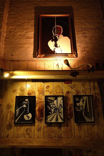
A particular theme is an illustratorly concentration on karma sutra imagery, present in a tryptich of digital prints as well as a series of paste-ups papering the stairway to the upper floor where Cept’s pop art comic aesthetic is displayed. Such images might be found in HowAboutNo’s flickr. The perve.
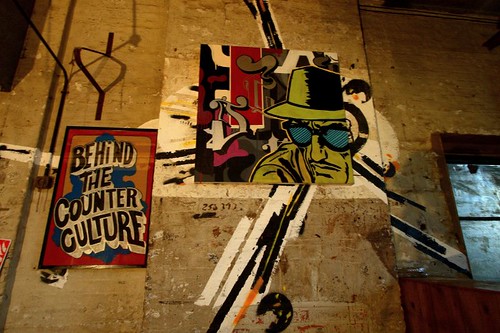
Borrowing images from comics and most obviously from pop art’s high priest Lichtenstein, Cept tells a romantic tale involving the anti hero, a super villain, lets call him Cept for convenience and a pure pop 1950’s ideal of feminine beauty, a girl who admires Cept the super villain both as a concept and as physical specimen. Her love is possibly tragic and un-requited, she cossets a Cept graffiti tag to her cheeks as nowadays the love for graffiti has come in from the cold.

Remember When Graffiti Was Hated (photo: HowAboutNo
Her intrigue with graffiti doesn’t subjugate her need for a man who possesses old fashioned qualities of infallibility, dependability and heroism. She dotes on the super villain but recognises and indeed admires the flaws in his character, awakening within her a fascination for his desire for possession of public space.
Meanwhile Cept the Super Villain is seemingly going through a crisis, split by his comic hero superpowers and the conflicting demands of the old fashioned modern romantic. So he still leaps unscathed from unexplained explosions,
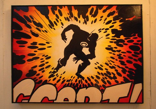
If It Kills Me (photo: HowAboutNo)
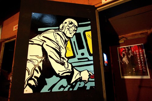
he coldly wields control over others’ destinies at the press of a button,
and un-swervingly faithful to his inner criminal, he gets his mark up on society’s walls
Privately however, angst nags at him, he senses the futility in endlessly repeating his super villain antics and where we find the super villain away from the women and the heroic deeds, we find canvasses depicting pain, despair and an inner tension.
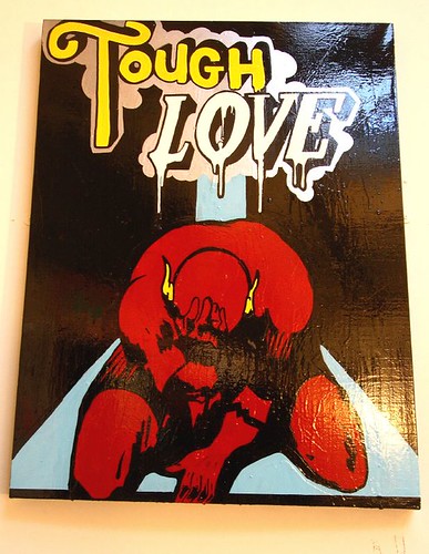
Tough Love (photo: HowAboutNo)
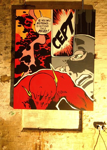
He Who Was Nothing – Is Nothing Once More (photo: HowAboutNo)
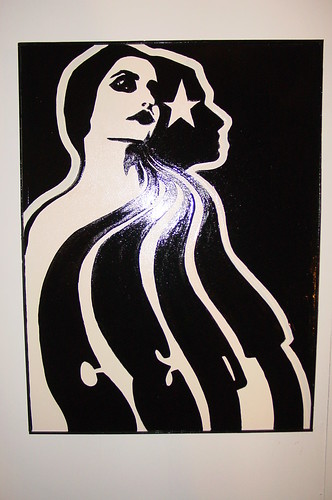
Cept showcases many more themes and styles apart from the comic hero imagery. He blends his skillz with the letter into his pop art imagery to greatest effect in this sharp almost art nouveau styled goddess, tresses of hair cascade down forming twisting into Cept’s letters.
Cept frequently likes to play with concealed images, where possibly random illustrations only reveal the true subject through some chance and close scrutiny.
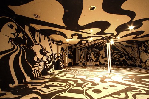
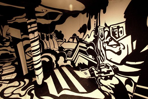
Descending down a second set of great fire of London era wooden stairs, which look like they ought to lead to a den of gin-sozzled, brawling women and opium wrecks, we stoop under a barrier blocking the top half of a doorway and emerge into the highlight of the show. A truly astonishing stark and punchy two-tone walls, floor and ceiling painted room of visual illusion and eyeball defeating trickery..
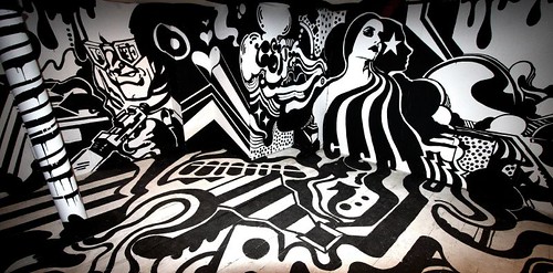
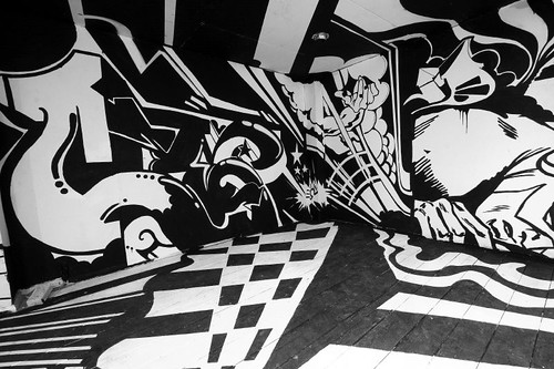
Your eyes are overwhelmed by the intensity of the contrasting lines, swirls, shapes and objects. Cept creates perspective, plays with it again for fun and creates an illusion of corridors, holes, seascapes blending into room interiors and a selection of characteristic Cept comic book imagery. The floor has wave ripples lapping up to strongly patterned venetian tiled floor, whilst in other parts a series of painted steps disappear down into a painted manhole sinking into the earth’s core.
Two roof columns create fountains of paint erupting from the floor, surging outwards across the ceiling before breaking against the walls. The doting beauty gazes fondly at Cept’s tag, yet nearby the super villain lies out of sight, drained, jaded and semi-comatose in the shallow waters lapping up over his name.
A series of painted steps across the floor leads to a trompe l’oeil image of a cufflinked hand at the end of a corridor clutching the letter C.
Using a deconstructed graff writing form in which the structure of the letters has been totally discarded to leave a residue of wild style elements, the painted structure breaks up into almost abstract swirls, dots and moiré fringes only to reform into regular geometric patterns.
It is un-avoidable that cynics will compare this room with D*Face’s dis-orientation room at the BRP Apopcalypse Now show last month but whilst that created a Keith Haring tribute using D*Dog wings and eyes, this Cept installation uses non repeating Cept imagery with not a single line or curve repeated anywhere. All of this was created single-handedly by Cept – no interned paint chuckers here – and took three weeks having been conceived before the D*Face show, though Cept confesses to a sinking heart upon entering the D*Face show and realising the extent of convergence with his work.
A curiosity worth mentioning is that from a previous use, apparently the walls of the installation room have a Mode 2 mural directly on the brick, Cept has clad the wall with boards to leave the Mode 2 beneath intact. Respect.
It is worth whizzing up to Dalston just to be overwhelmed by one of the most intense visual experiences this year and one of the most satisfyingly staged shows (we do like our spaces rank and grubby). Bang loudly on that shutter door, but do it fast as the space is only open to the public until Sunday 30th, excluding Wednesday and Friday. Bugger it, check with Stella Dor before travelling!
Taking pictures in such challenging light without safety harness and hard hat contravenes all photographic health and safety regs, so hats off to HowAboutNo – check his pics here

